Tuesday, December 17, 2013

Signed, Framed, and Hung!

I have not been painting as much as I would like to, with holiday events taking up a lot of my time. However I am very excited to have framed and hung a small collection of my paintings. Each step was a choice I had to think through carefully, starting with choosing a signature. I am fortunate that Margot has Harry come by her house fairly often with a van filled with frames. I chose four 12x16's and two 9x12's. I learned how to use the drill to attach the clips, and to set the hooks for the wire.

It was very rewarding to get positive feedback from our Holiday party guests. But I will admit that I think a couple of the black frames look too severe on our walls, even though they set off the paintings nicely. This gold frame looks great against the oak paneled wall.

Even when I can't actually paint, I try to move forward in some way to improve my art.

Sunday, November 3, 2013

Early Morning Walk

Early Morning Walk

This painting was really fun to do. The backlighting was so soft and lovely in the early morning. I wanted to try to keep it to just two values, like day and night. I know that's probably breaking some rules somewhere. I might do it again, and bring out more of the subtleties in the shadows. I hope you can see it from this photo.

Friday, October 25, 2013

Ancient Gorilla

I visited my husband's office and saw this watercolor that I did many years ago. Still fun and playful. When people see my name, they ask my husband if this is a family member. They are referring to the signature, but he likes to think it refers to his family tree.

Moving Forward

I haven't posted for awhile, but that doesn't mean I haven't been busy!

I am studying with Margot Lennartz, attending a weekly workshop. Margot loves landscapes, particularly California scenes. Her career spans decades of successful painting. Her home is filled with her work, and she still enters and wins juried shows on a regular basis. She has an amazing ability to help each of her students regardless of the many different styles. It's a fun and supportive environment. I am loving it!

I also feel that I have "arrived" and can now do my own art the way I want. I thought this painting of a ranch near Cayucos was done. Now that I look again, I see several small things I still need to do. I love the overall feel of it, though.

Okay, so you want to know what I'm going to change...
It needs a small indication of a shadow to the left of the red trough in the foreground. The two trees on the left need better highlights and shadows in the branches. And I have to do something with the yellow patch in the center above the purple trough. That brushstroke has bothered me since the minute I put it on! I think the yellow color is too bright for that place in the picture, or maybe it's the contrast with the purple is too strong. I also have too much blue showing through from the underpainting - easy to fix.

I love the sky. Margot encouraged me to paint the sky yellow,  rather than the even, mid-tone blue of my source photos. (This photo of the painting makes the purple on the left stand out more than it actually does in the painting.) The yellow sky softens and unifies the entire atmosphere of the scene. Now that I have done it, I understand it. The sky area is so narrow that there isn't space to develop into the deep blue of the overhead sky. All that shows is the pale light near the horizon.

Friday, September 20, 2013

Sunny at 3Kicks Art Studio


Our term has ended at 3Kicks Studio. I wanted to sign up for the next term, but I would miss too many classes to make it worth it. Sunny has  helped me a lot. I felt so awkward and unsure of myself at the first class. I didn't know how to lay out my palette or to begin to design my painting. In the ten weeks of the class, I have definitely gained confidence as well as skill. 

I painted these flowers on the last day, getting the painting this far in one session. Actually, the vase had a pretty lopsided arrangement in it, with the flowers in a circle poking toward the outside. I added the large flower in the middle when I got home. It was just greenery and stems in life. This is a 9x12 canvas. I think the apple is the star of the show. Like many students,  I have probably painted more apples than any other subject! Doing this still life made me realize I need to paint more flowers, and fabric folds too!

Sunny helped us by commenting as we worked. He also would show students techniques by painting on their canvas, with permission of course. It really helped to see exactly how to do something. I look forward to signing up with him again in January. I love it that we can do both still life and portraits in his class.

 Sunny can make sense of anyone's painting! He goes from one canvas to the next, looking, evaluating, and moving the piece forward somehow.


Monday, September 2, 2013

Portrait of a Pensive Girl

I am really enjoying my Sunday morning classes with Sonny Apinchapong. I can tell that I am growing and learning. He believes that still life studies are the key to good portraits and landscapes. I love being able to go straight to the portrait with a live model. I learned a lot from doing this portrait. It looks a bit boring as a piece of art, but I have to recognize that this is my time to learn, not constantly evaluate. Despite its flaws, Sonny pronounced it "a good likeness".


Monday, August 12, 2013

Back to the Drawing Board


Left: Value study of twins from a photograph
Right: Copy from a Sargeant drawing of Mrs. Horace Webber

Here is my drawing board. Both of these were basically quick studies, done in less than 30 minutes (I think). The Sargeant portrait is from the Dover book of his drawings which are black and white studies. It makes it pretty easy to copy exactly what he did, although if you compare mine to his you will see how many places need to be fixed.  I need to work on how to do the nose and mouth, so this is really helpful.

The value study from the photograph presents a completely different set of challenges and learning. First of all, I had to find a photo that lends itself to becoming a portrait. Then I realized that I don't have much experience drawing from photos. I chose this one because the two boys are identical twins, but don't actually look exactly alike. I wanted to see if I could capture the difference. Shane is pretty close but Nathan got lost back in the shadows. Those shadows again!!

It is also interesting to put these side by side. Clearly Sargeant had an eye for composition and contrast. He knew how to accentuate the features that he wanted to describe. Striking.


Flowers in a Blue Vase


 Flowers in a Blue Vase
I had fun with this painting done in class. The challenge was to represent the bright light. The colors were all over the place. I thought I wasn't going to like the set up - I was itching to reposition the flowers into a better arrangement. But as I painted I found I liked the balance and the confusion of the huge blossoms. Sonny, the teacher, helped me to simplify the shadows on the wall behind the flowers. It reminded me of Anne's caution: "Don't stare into the shadows!'

The teacher's overall comment was to continue to paint more and practice better drawing skills. Hmmm. I thought drawing was a relative strength. I guess it is, relative to anything else I can do! 

So, I need to work on my drawing and hope it will draw the rest of my skills along with it:)

Monday, July 22, 2013

Fruit with Pitcher


Cropped to show the part that I like best

 I have started a workshop class at 3Kicks Studio in Pasadena. Here is the first still life set-up that I painted. There was another still life choice and also a live model. I will do those in future weeks.

I got good feedback from the teacher. The challenge, of course, was to paint gray on gray, with very subtle value and temperature differences. He wasn't too impressed with this, but not too critical either. He guided us along, suggesting ways to keep it simple and focus on what was important. Mostly he said to "just keep painting and you'll be able to train your eye..." I feel like my eye is okay, it's my ability to render what my eye sees that is the problem!
Classwork
 
I may still go back and fix up the parts that are weak, or I may just move on and paint something different. I haven't decided yet.

I did two homework paintings of a gray on gray set-up. The teacher liked the set-up with the silver tray, and liked the solid feel of the objects. But the fruit looks flat - not enough light contrast - and the bottle highlights are too much. You can see that I kept this in mind as I finished my painting in class. Nice round fruit and not too much on the bottle. As for the wobbly lines, such as the edge of the plate, that's just me getting used to oil paint. It doesn't stay where you put it! I started with a nice even curve, but by the time I got the shadows in there and added the print to the fabric, the plate was a wobbly mess!
Homework

I will definitely move on in class to the next still life set-up. Enough of the gray on gray.

Friday, June 14, 2013

Color and Light

Ugh.
I am glad this class on color is over! I did learn a few things. But mostly I wasted a lot of paint.


Tuesday, May 28, 2013

Color Blocks

My art teacher was a student of Henry Hensche. It was his teaching method to have students paint colored blocks in different light as a way to study color. So our assignment is to collect and paint wooden blocks to represent the different color attributes: value, intensity and hue. Then we paint them over and over in different lights. I can see that this will really help me to SEE the colors and the light more accurately. It will also give me the practice and discipline to mix paint efficiently and effectively. It's like playing scales on the piano. Sigh.

I finally found a way to get a little bit more excited about this. I did the study, using cool colors on a cool cloudy morning. There really were no shadows at all. Bowing to the importance of simultaneous contrast (please be impressed), I carefully found the color of the cool, dull cloth underneath the blocks. But what about the rest of the background? It defines the color, too.

And so, kind viewer, can you guess what is at the top of my composition? It is the lovely camelia branches hanging down over the dewy wet garden bed. The color of the soil is accurate, and the three blocks of color for the leaves are very close. I'll see how my teacher reacts to this before I dare to paint in the hummingbird.

Hollyhocks

I am supposed to be painting blocks of color using a palette knife. I find it so boring and uninspiring!
Sooo, I went outside and painted our hollyhocks instead, using my brushes on a canvas board instead of the gessoed masonite we use in class.

My family and I have been watching these flowers slowly grow from a a mass of huge undefined leaves. We joked about the Little House of Horrors flower while we waited to see what these flowers would finally look like. They finally began to open and now are in full bloom.

The challenge in painting them was first, to simplify the composition enough to make the flowers stand out. They are against our fence with the oaks and sycamore behind them. The second thing was to somehow make all that green on green look both different and interesting. I am happy with the way they came out.

It was especially fun just to do what I wanted and be free of the requirements of my art class.

Dan McCaw Workshop

 Dan McCaw put on a painting workshop and demonstration this past weekend. He has a fabulous career as an artist, teacher,  and author. He spent most of the morning with a slide show and powerpoint presenting and commenting on his many years of work. It was really interesting.

He works closely with his two sons, who are also becoming successful artists. The interplay of ideas, and the physical support of having others to help build and transport the works, has clearly brought Dan a great deal of pride and joy.
 For his demo in the afternoon, he did this "head" as he simply calls this new phase he is in. He has done a large number of them, working from his imagination. He emphasized that he is exploring his own choices in art now. He feels freed from the demands of gallery success and popularity. He is aware that these heads are not "light and pretty" like the lovely beach scenes he has done, that they are not to everyone's taste. He has finally given himself permission to not try to please everyone!
 I love the pictures he has done of cafe scenes, with the lovely indoor light dramatizing a character or group of people in a seemingly leisure moment. His dark, brooding heads are not my preference. But despite that, I applaud Dan for finally following his own vision and imagination. It takes courage!

Saturday, May 18, 2013

A tribute to Betty Edwards


In 1995 I was lucky enough to take Drawing on the Right Side of the Brain at UC Long Beach from Betty Edwards herself. I had already taken this drawing class from John trees at Pasadena City College and had pretty good drawing skills. Betty's class was actually designed for people who wanted to learn to teach drawing. And I learned to draw so much better!


This chair was a class lesson on negative space. It is a cornerstone of her program, so as a class, we gave Betty a small model chair.

The truly amazing thing about Betty's class was her ability to teach each and every one of us to draw confidently with accuracy. I never did become a "Drawing on the Right Side..." instructor, but I did use a lot of what I learned in my classroom.

Betty was the first to say, drawing is not art. And I loved her comment "The best reason for bad art is: that is the way it looks". I thought of that specifically when I listened to Michael Obermeyer talking about moving objects around in his composition if, in life,  they weren't laid out the way he wanted them. He would move trees in or out of his picture, stretch them to fill space or shrink them out of the way. He would literally move mountains.

Once I learned to draw I really should have kept at it. Looking at my self-portrait now, I see several errors based on what I have learned from Anne Satzyk. Onward.

Wednesday, May 8, 2013

Three Pears


Back to basics! The weather has continued to be cloudy and gray, even when the rain stops. So I stayed inside and went back to fruit. I need to learn to be more objective about my work. When I finished these, I was pretty unimpressed. I felt like I was going backwards. Now that I look at them again, and compare to the work I have done before, I can see some progress. I definitely remembered to keep asking the questions our teacher taught us - darkest darks, relative values, warm/cool - so that I could make the decisions necessary to keep moving forward.

Painting fruit makes me remember my commitment to complete my first two hundred paintings!! I think I have about 160 to go!! I hope persistence is more valuable than innate talent.

Verdugo Adobe

My next adventure was to the Verdugo Adobe. We had several fun field trips here, walking from school and spending time at Verdugo Park on the way. My memory was of a peaceful, wooded park. That is true, but it was really challenging to find a decent view of the Adobe. The trees are in the way from all sides, and there is a strange block wall, built in recent times, that blocks what view there may have been.

I decided to try to capture the comfort of the shady porch, with the bright sunshine showing through at the end. Again, the lighting was very tricky. I saw a plein air picture online of a scene of the bight sunny ocean, looking out from inside a dark cave. That was the feeling I had here. Looking into the light from inside a cave! I'm not sure why I couldn't make the floor flat. The whole building is at odd angles, sagging and warping. The floor was worn and wobbly, but not as much as it seems in my painting!

Hahamonga Park on a Cloudy Day


I haven't posted for awhile but I have been working and moving forward with my art. I spent some time scouting out good places to paint outdoors. This is a spot at Hahamonga Park. It was cloudy, but I was determined to try to paint something anyways. Luckily the sun came out for a moment and I was able to understand the light a little better. What a difference it made!


Wednesday, April 24, 2013

Obermeyer Workshop


I spent three wonderful days in Laguna at a workshop with Michael Obermeyer. I did several paintings, each one a new piece of learning for me. This study and the next one were done from Heisler Park. Here I believe the view is to the north. While many of the artists faced south, and therefore had the morning sun in their eyes, I looked this way to be able to capture the morning light without so much glare. I learned that even though I could see this point of land clearly in my mind's eye, I need to lower the values on the distant shapes. The ocean in the foreground was not my focal point, so I left it blurred. Actually, I should have increased the value even if I did not increase the details. I did start to render that rock more carefully, but it was a challenge. The light and the tide changes quickly!


I moved to a new location and faced south. I tried to get the values more accurate on this one, keeping the foreground deeper and fading in the distance. Michael showed me how to populate the hillsides with the rows of houses. It does not show clearly enough, but I also learned to use the color of the reflected sky in the ocean. I know I don't have the balance quite right yet, as it looks like a rather abrupt change. But time is always the challenge.

One fun part of this day, of course, was working with other plein air artists trying to improve our skills. It was a large group of 16 people, so Michael was going as fast as he could to get around to all the different groups and settings. The other artists near me gave really helpful tips and feedback. I think my comments helped them also. It was a very congenial group.

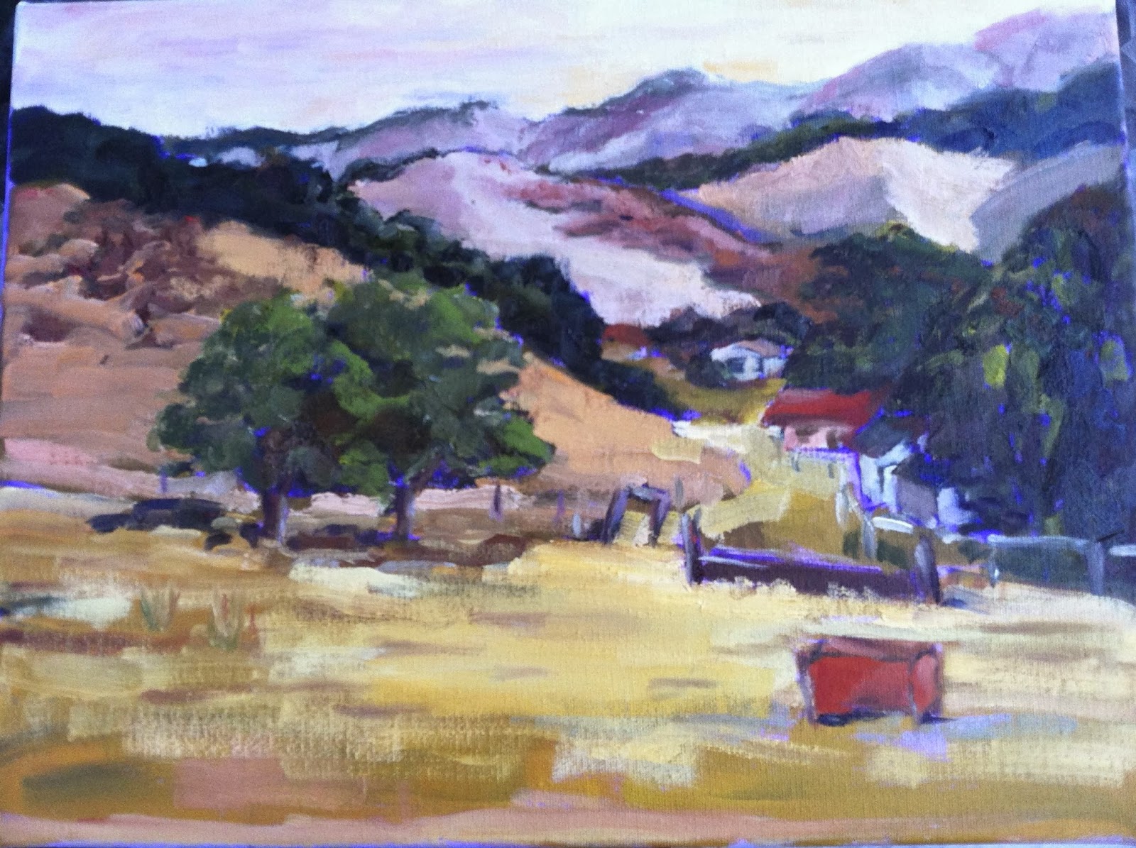
We went to the field across from Michael's studio the next day. Simplify, simplify, simplify! I took more time on this painting. I actually rubbed out whole sections and repainted them as I realized more fully what I wanted to do. How liberating was that! In all of my paintings Michael and others commented with praise on my brush strokes and bold color. So I guess I have some strengths to build on:)!


As I look at these studies, I may spend some extra time on each one and see if I can improve them without losing the freshness of being there en plein aire.


Thursday, April 18, 2013

Final Classwork - Figure

I am very excited about going to Laguna to a plein air workshop this weekend. I have a new easel to try out - a birthday present. It feels a bit daunting to pack up everything that I need to paint, as well as everything I need to go away for a three-day weekend.

Our last painting class this week was interesting. It became mostly a discussion of the benefits of meditation. We had a model and were trying to paint a full figure. I really need to take that figure drawing class! Just getting the drawing done was huge for me! And then trying to find paint colors for the different shadows on the skin tone... I was not at all happy with my painting. I finished it up a bit more at home but it's hard to do much without the model. She had awful raccoon eyes. I managed to subdue that a little but the colors are still rough. I did capture the general shape of the figure and the dramatic lighting. It always comes down to having enough time. Although I had the picture up on this blog for awhile, I have removed it. I just don't like looking at it!!

Sunday, April 14, 2013

Figure with facepaint


This is my most recent classwork. We were trying for several new techniques: using thick vs thin paint, leaving some areas incomplete to de-emphasize their importance, and drawing with the brush. Although I did not come close to finishing what I was doing, I am happy with certain parts. I feel that I did capture the pose. The shirt and the raised knee seem right even though they are under-worked. I like being able to draw with the brush. That is much more natural for me.
I also was getting the face mapped out pretty well. The heavy facepaint and the crazy spiked hair was the challenge, of course. I needed to fix the white stripe to get the shape of the nose, but I like his eyes and mouth. And this is the expression he had on his face. I would have like to develop that more.

My next class will be figure drawing. That will help a lot with this type of painting. I am really looking forward to it!!


Saturday, April 6, 2013

A Portrait


This was our model in our last art class, dramatically lit with green on the right and red on the left. The challenge was to "push" the color while trying to reveal something about the real color of the object underneath. Impossible, which made it kind of liberating!
So the picture above is how I got started. I was pleased that it at least looked somewhat like the guy I was looking at! I didn't get much farther than this in class. I kept working on it once I got home - hard to not have the model still in front of me, but some of the changes were obvious. I softened the planes of the forehead and finally found the shadow side of his nose.


My big accomplishment for the day, besides painting, was to create "wet panel carriers". My homework is still wet as I go to class, and my classwork is wet when I come home. And we have so many sizes for our canvas panels! So off I go to bite the bullet and buy a bunch of carriers at the art store. They had just finished setting out a new shipment of panels, and there were the empty boxes for each size. Hooray!
 I put strips of foamcore on the insides for supports. I found tote bags to fit each size. In the photo I am still looking for those last two sizes, but I did find them.

I am doing my big Homework Review in class this week. I have to bring everything I have done. So it's even more helpful that I will be able to carry all the wet paint to and fro. Here is my most recent homework.
Too much blue background, but the dishes came out okay. I am supposed to have close to 30 completed paintings. I'm almost there. Back to work.


Tuesday, April 2, 2013

Moving past self-critique

Okay. So you see the painting of white on white, done with a palette knife. I was very unhappy with it when I did it. It seemed like too much moosh, and not enough definition of the shapes and values.  I brought it to my class today and the teacher loved it (pretty much, with some comments). So did the others in the class. Go figure.

We had a great class, so congenial. I am unbelievably fortunate to meet such wonderful people in art school!! I will post my classwork soon when I have time to get it photographed and uploaded.

Monday, April 1, 2013

Painting white objects

Here is the plan for my "white on white" painting. It looked simple enough. I just needed to pay attention to the detail of the values and the reflected colors.


Here is how it ended up. Yuck.

I am going to keep working on this. I actually went back into this painting while it was still wet to fix the ridge on the large jar at the back. That helped a lot. So probably the devil is in the details on this painting. It may not be as far off as it looks.

Saturday, March 30, 2013

Argh! I didn't paint today. But I did do a lot of thinking about my painting, and researching what other direct painters are doing. I am so impressed with the artists who can really keep up with the "one painting a day" discipline. And I am in love with the way a simple composition of fruit or a few carefully chosen objects can convey so much.

My challenge: I tried to paint three white objects. Okay, white is the scary non-color that has to be addressed so I figured I would jump in and try it. What a mess. Waste of paint. In a moment of what-the-heck, I also did my white-on-white using a palette knife. In our last class we used a palette knife which I remember as being impossible from the time I first tried it in high school art class.  My daughter thought I had painted rolls of toilet paper@! Yup. that's what it is. I'm going to use that canvas as my palette, and just lift the paint off to create another painting.

I will not give up!! Values. I just need to be more attentive to the values. I went to Home Goods and actually bought  a couple of white pieces (cheap) with better shapes. Not so much like toilet paper rolls. Keep your fingers crossed for me. I'm going to try again, but with a paint brush not the palette knife.

Friday, March 29, 2013

Alla Prima painting


We began our Alla Prima adventure with a limited palette: titanium white, burnt umber, and ultramarine blue.

The rub-out picture of the apple felt like fancy finger painting, dabbing away the paint with paper towels. It was pretty frustrating at the time, so I was happily surprised when it came out actually looking like an apple! This is not a very good photo, since the edge of the canvas is visible making that slanted white line.

Values, values, values! With such a limited palette, we were forced to concentrate on just getting the relationship between the values mapped out.


Wednesday, March 27, 2013

And so I begin

This is the place to view my progress as an artist. I am taking a class from Anne Saitzyk at Art Center at Night. I absolutely love it and plan to take more classes there when this one is complete.

My goal is to share with others, to get feedback, and to challenge myself to paint, paint, PAINT!