I am going back to doing some still life subjects. It's a bit discouraging. It takes me ages to set up a still life that I think I will like. Then I start painting and realize I don't like the set up at all.
I did manage to put some oranges in a bowl and paint them for the "garden" show at a local gallery. I would have given up on that one without the help of Margot and my fellow painters in her workshop. With their feedback I realized I had come much closer to creating a good painting with just my initial work. I needed to fix the background and then it all came together.
Now I am painting some backyard flowers. Ugh. Again, I think the problem is the background. I hung a yellowish cloth behind the flowers, but the yellow and the green of the leaves combines to look sickly. I'll probably scrape it and start over.
I know that I'm putting a lot of pressure on myself to create quality, completed paintings with every canvas I start. Sometimes I am at a loss for what to paint next. Right now I am confused by which started painting I should try to finish!
Sigh.
Tuesday, January 28, 2014

Tuesday, January 14, 2014
Sante Fe Dam
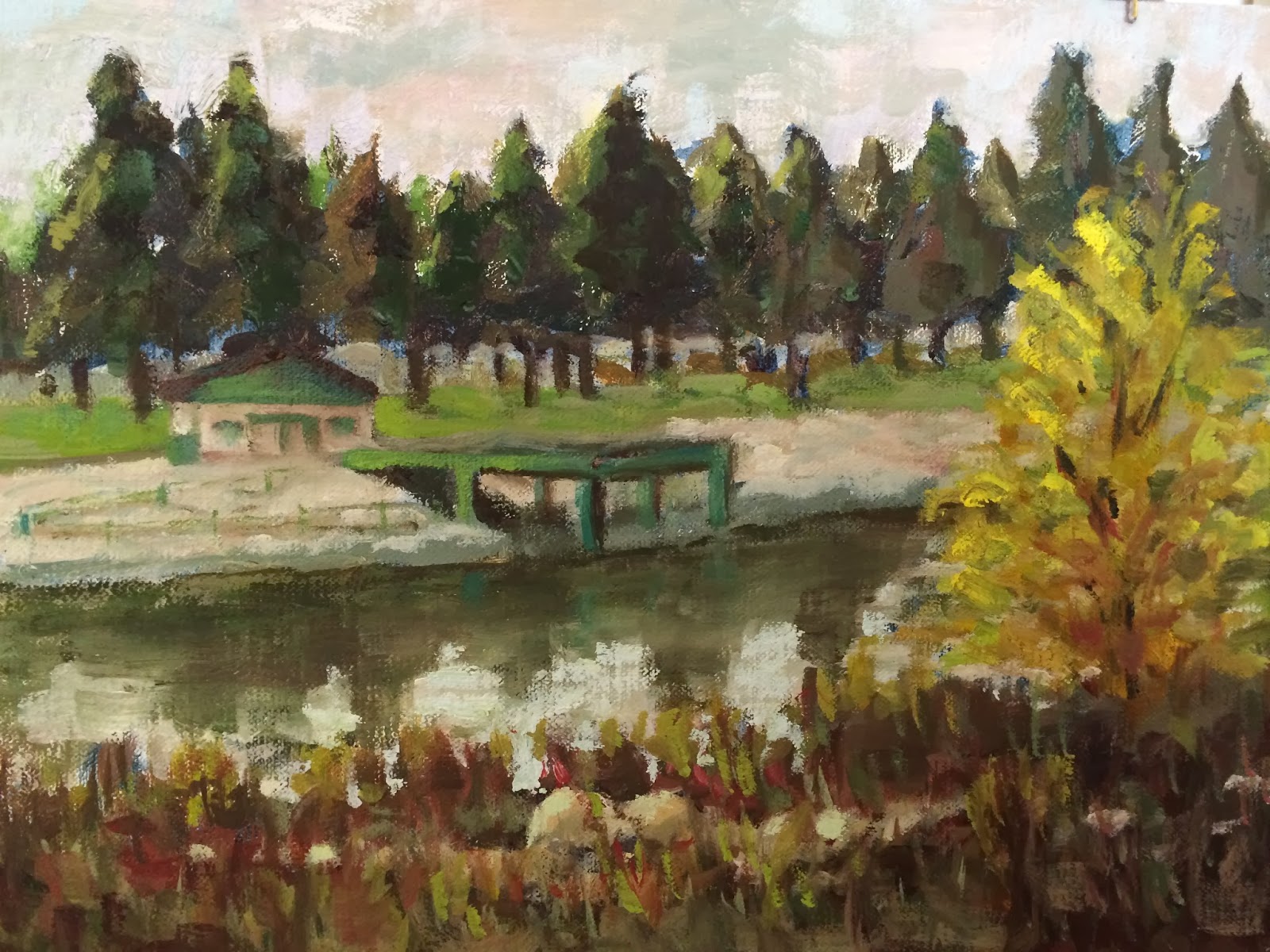
Here it is with the red roof. Which do you prefer?

I think Edgar Payne would call this a steelyard composition. There are the two strong verticals created by the two pines in back and the yellow bush in front. These are connected and balanced by the horizontal of the little pier. If you are an artist, maybe you can give me more guidance on this. I think the composition of plein air paintings makes all the difference between a successful piece and a "nice try."
What you can't see is the amazing sound of the laughing ducks and geese that were wandering all over the lawns.
Thursday, January 2, 2014
Winter in Lacy Park

Winter in Lacy Park
Hello everyone. Happy New Year!
I had a wonderful holiday season, with lots of celebrations visiting with family and friends. Thanks to all of you who were at my house and gave positive feedback on the work that I have up. It's exciting to have them on display!
Now I am glad to get back to a routine schedule. I have decided on a pretty rigorous schedule of painting.This 9x12 panel is the result of my first outing with the "Thursdays en Plein Air" group. It was a gorgeous day in the park, with warm sun and hardly any breeze. The trees are almost bare for the winter. I am happy that I was able to decide on a scene and more or less complete it in the two hours we painted. I'm not sure I'll keep this one, though. There is something about it that isn't right. I'm still not sure exactly what! Regardless, I am looking forward to painting with this group each week.
I also plan to attend Margot's workshop as I have been doing. And I will go to Sunny's weekend workshop when it starts up again in a few weeks. Sunny does more with still life and live models, which is what I need to study. My goal for this year is to put together a sizable body of completed works that I can present and sell. Between all of these opportunities, I should be able to do that.
Thanks for visiting this blog! I hope to post more frequently now (and to exercise more and lose weight and remember everyone's birthdays and ...).
Tuesday, December 17, 2013
Signed, Framed, and Hung!

It was very rewarding to get positive feedback from our Holiday party guests. But I will admit that I think a couple of the black frames look too severe on our walls, even though they set off the paintings nicely. This gold frame looks great against the oak paneled wall.
Even when I can't actually paint, I try to move forward in some way to improve my art.
Sunday, November 3, 2013
Early Morning Walk

Early Morning Walk
This painting was really fun to do. The backlighting was so soft and lovely in the early morning. I wanted to try to keep it to just two values, like day and night. I know that's probably breaking some rules somewhere. I might do it again, and bring out more of the subtleties in the shadows. I hope you can see it from this photo.
Friday, October 25, 2013
Ancient Gorilla

Moving Forward
I haven't posted for awhile, but that doesn't mean I haven't been busy!
I am studying with Margot Lennartz, attending a weekly workshop. Margot loves landscapes, particularly California scenes. Her career spans decades of successful painting. Her home is filled with her work, and she still enters and wins juried shows on a regular basis. She has an amazing ability to help each of her students regardless of the many different styles. It's a fun and supportive environment. I am loving it!
I also feel that I have "arrived" and can now do my own art the way I want. I thought this painting of a ranch near Cayucos was done. Now that I look again, I see several small things I still need to do. I love the overall feel of it, though.
 Okay, so you want to know what I'm going to change...
It needs a small indication of a shadow to the left of the red trough in the foreground. The two trees on the left need better highlights and shadows in the branches. And I have to do something with the yellow patch in the center above the purple trough. That brushstroke has bothered me since the minute I put it on! I think the yellow color is too bright for that place in the picture, or maybe it's the contrast with the purple is too strong. I also have too much blue showing through from the underpainting - easy to fix.
I love the sky. Margot encouraged me to paint the sky yellow, rather than the even, mid-tone blue of my source photos. (This photo of the painting makes the purple on the left stand out more than it actually does in the painting.) The yellow sky softens and unifies the entire atmosphere of the scene. Now that I have done it, I understand it. The sky area is so narrow that there isn't space to develop into the deep blue of the overhead sky. All that shows is the pale light near the horizon.
I am studying with Margot Lennartz, attending a weekly workshop. Margot loves landscapes, particularly California scenes. Her career spans decades of successful painting. Her home is filled with her work, and she still enters and wins juried shows on a regular basis. She has an amazing ability to help each of her students regardless of the many different styles. It's a fun and supportive environment. I am loving it!
I also feel that I have "arrived" and can now do my own art the way I want. I thought this painting of a ranch near Cayucos was done. Now that I look again, I see several small things I still need to do. I love the overall feel of it, though.
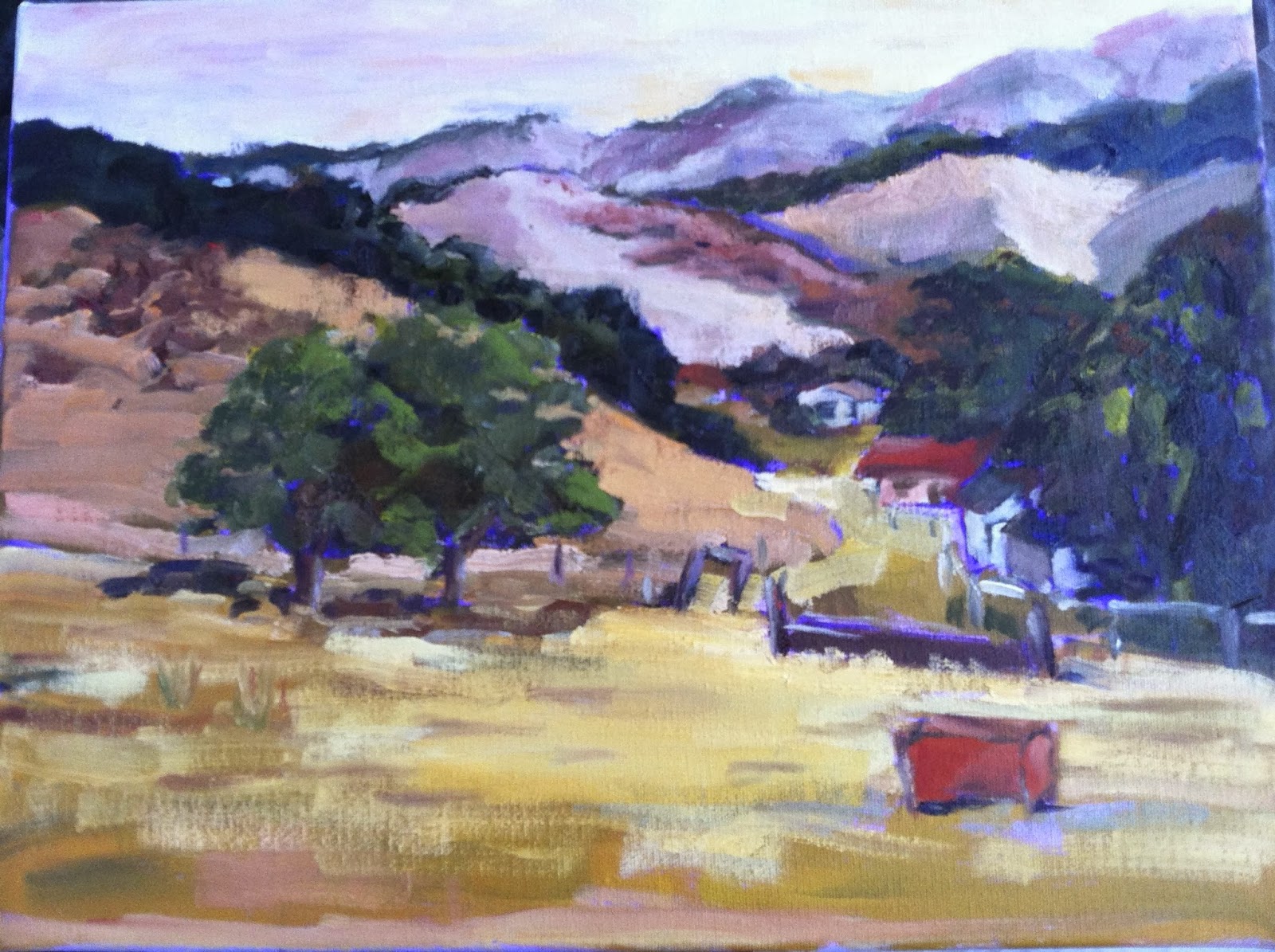
It needs a small indication of a shadow to the left of the red trough in the foreground. The two trees on the left need better highlights and shadows in the branches. And I have to do something with the yellow patch in the center above the purple trough. That brushstroke has bothered me since the minute I put it on! I think the yellow color is too bright for that place in the picture, or maybe it's the contrast with the purple is too strong. I also have too much blue showing through from the underpainting - easy to fix.
I love the sky. Margot encouraged me to paint the sky yellow, rather than the even, mid-tone blue of my source photos. (This photo of the painting makes the purple on the left stand out more than it actually does in the painting.) The yellow sky softens and unifies the entire atmosphere of the scene. Now that I have done it, I understand it. The sky area is so narrow that there isn't space to develop into the deep blue of the overhead sky. All that shows is the pale light near the horizon.
Subscribe to:
Posts (Atom)